A3—Tableau analysis
Due F 2022-02-11, 11:59pm EST 16pts
Follow the instructions below and submit a single PDF for the assignment.
Please post any questions about this assignment on Canvas in Discussion: A3—Tableau analysis.
Warning: This is an individual assignment.
Table of contents
Change log
- 2022-02-08: Clarified the expectation that you make a screenshot to include in step 6.
- 2022-02-07: Clarified a grammatical error in step 5. Several students got a bug bounty for reporting this! +1 pts
Aim of the assignment
You will practice using Tableau for visual exploratory data analysis and for communicating your insights, building upon what you learned during the in-class activity. You will also practice importing and reshaping a dataset.
Background info
For this assignment we are exploring Census data to understand who lives in the South End of Boston and how the population has changed over time.
The census tract for the South End begins just on the SE side of Columbus Avenue, as shown in this map:
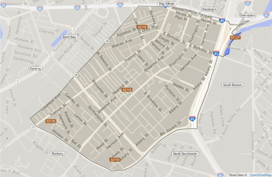 Image credit: Statistical Atlas
Here is a view from the top of the Prudential Tower. The south end begins just on the other side of Union Church in the center:
 Image credit: Richard Schneider
Instructions
Download this compiled Census Data for the South End:
SouthEndCensusData.xls. All data is from the 2010 Census except the sheet called “decades” which is compiled over multiple Census datasets.- Start writing a document in your favorite word processor / document preparation system.
- Write
A3—Tableau analysisas the title.
- Write
- We will be conducting “hypothesis driven” exploration in this step of the assignment. Instead of just diving into the data with free-form exploration, we will have guiding questions to help us explore the data. Below are two hypotheses to answer with the dataset. Please generate two additional hypotheses to investigate (i.e. what other insights can you gain from this data?):
- The population in the South End has steadily declined over time.
- The dominant age group in the South End is aged 20–54.
- YOU CREATE
- YOU CREATE
- In your document, start each hypothesis on a separate page:
- Write the hypothesis as a section heading.
- Create a page break after it so that each hypothesis starts on its own page.
With Tableau, generate at least one visualization for each of the above hypothesis to confirm or disprove them.
Note: Feel free to reshape the Excel spreadsheet as necessary to answer these questions. In fact, you will have trouble doing this assignment without reshaping the data.
See Tableau’s Tips for Working with Your Data if you need guidance with reshaping and formatting your data so you can analyze it effectively.
Copy and paste the visualization for each hypothesis into the associated section of the document. You can do this in Tableau by right-clicking on the main part of the visualization and going to “Copy→Image”. Alternatively, you can just take a screenshot that includes any necessary legends and filters.
- For each visualization, write a few sentences to:
- Justify your choice of visual encoding and visualization design choices (i.e. marks, channels, perceptual ordering, data type, etc.)
- AND explain your data insights in support or contradiction of the associated hypotheses.
Submission instructions
All parts should be submitted as a single PDF to the assignment A3—Tableau analysis on GradeScope. Please use GradeScope’s “tagging” interface to associate each of your hypothesis with the associated questions of the rubric.
Grading Rubric
| Criteria | Points |
|---|---|
| Hypothesis 1 has effective visualizations + text to justify and explain insights | 4 pts |
| Hypothesis 2 … | 4 pts |
| Hypothesis 3 … | 4 pts |
| Hypothesis 4 … | 4 pts |
| 16 pts |
Like usual, the visualizations should follow our the best practices and everything you’ve learned in class up to this point. E.g., include axis labels, appropriate scales, titles, legends, annotations, be neat and clean (not cluttered). Points will be deducted for poor quality or confusing visualizations. Likewise, points will be deducted for spelling and grammar mistakes.